

Put it on the tab
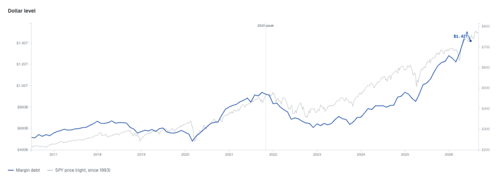
In recent months, the chart shown in Figure 1., has been doing the rounds, inspiring fear among some observers that a stock market crash is imminent.
Figure 1. Financial Industry Regulatory Authority (FINRA) margin debt
Source: FINRA
Figure 1., shows the total amount investors have borrowed against the securities in their margin accounts at member broker-dealers, reported monthly under FINRA Rule 4521. It’s the cleanest read on how much leverage is riding on the equity market.
The fear stems from both the record level of debt and the more recent retreat in margin debt.
Because the nominal dollar figure of margin debt (Figure 1.) can be supported by a larger economy, however, many observers believe comparing margin debt with Gross Domestic Product (GDP) gives a better sense of how stretched debt-fuelled equity positioning really is.
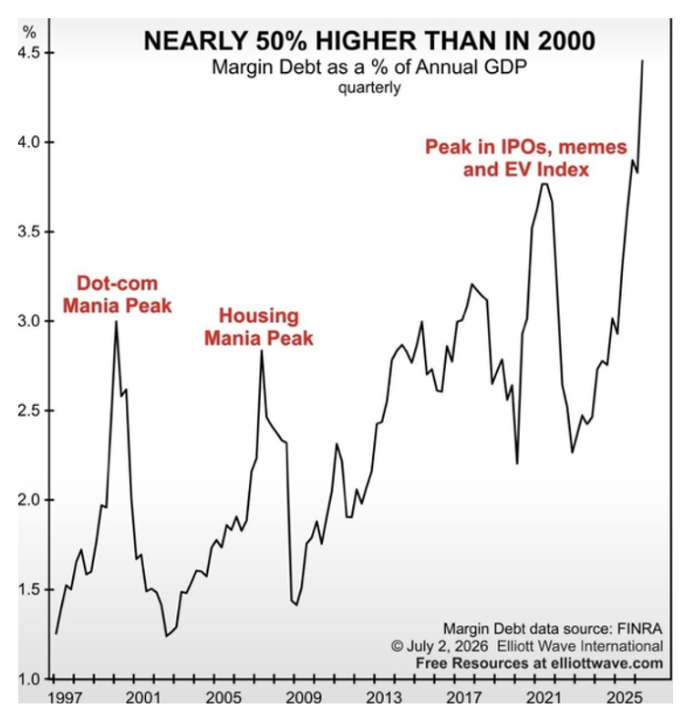
And so, another fear-inducing, and oft-made, comparison is Margin Debt to GDP. U.S. margin debt reached roughly 4.5 per cent of GDP in June 2026, the highest level in the compiled series, putting leverage above the peaks seen before prior crashes, around 2000, 2007, and 2021.
Figure 2. U.S. Equity Margin Debt to GDP
Source: FINRA, EWI
Understandably, with all measures at or near record levels, market commentary surrounding equity margin trading is feverish. When nominal margin levels smash previous records, permabears and short-sellers, including Michael Burry, invariably compare today’s AI-fueled rally to other margin-fuelled periods of excess.
Recently, Burry highlighted a viral Substack that asserted a historical rule:
“Every bubble in history popped when margin debt hit 3% of GDP (1929, 2000, 2008…). Today it’s at 4.5%,”
Personally adding,
“It will be a doozy when it comes down.”
But the margin debt signal is easily misread and therefore, frequently misunderstood. To understand why this is common, we have to explain the role of the denominator in the frequent comparisons with GDP, and how portfolio liquidations occur.
Margin/GDP vs. Margin/Market Cap
The core issue I have with drawing the conclusion that a crash is imminent simply or solely due to a high Margin-to-GDP ratio is that, over time, the market itself has become much larger and therefore a bigger component of the economy and GDP.
Gross Domestic Product (GDP) measures annual national economic output – a twelve-month flow of goods and services. Margin debt, conversely, is asset-backed financial leverage extended against investment portfolios – which, of course, is a claim on equity market capitalisation.
Over the past century, and particularly across the last two decades, the composition of the economy and the stock market has changed dramatically.
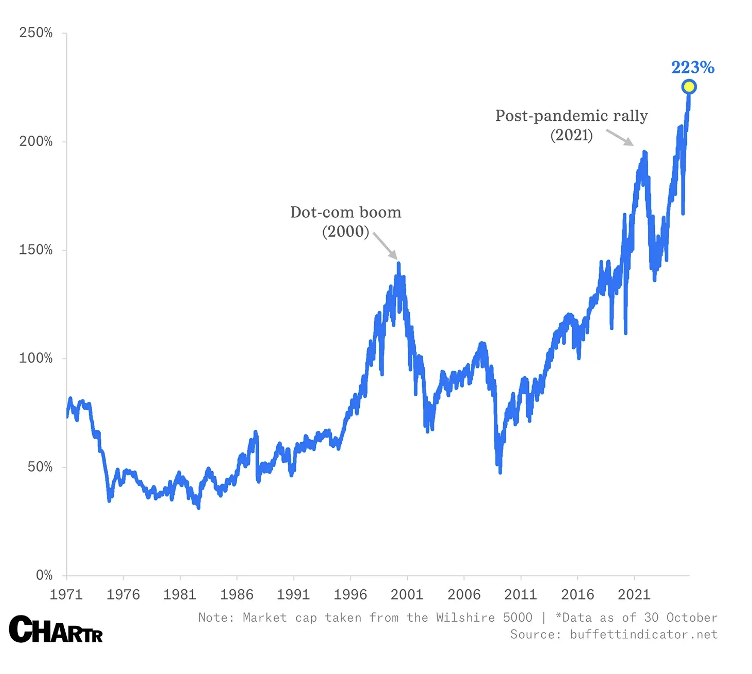
The consequence is that total U.S. equity market capitalisation now sits at roughly 200 per cent + of GDP, which is an all-time high, in its own right. Called the “Buffett Indicator,” Market Cap-to-GDP has historically been said to signal an imminent crash when it exceeded 120 per cent – a level it has now persistently been above since 2018 (Figure 3).
Figure 3. Buffett Indicator (Market Cap-to-GDP)
Source: Buffettindicator.net
Because asset prices have expanded dramatically relative to economic output, the stock market, which is an aggregation of those assets/companies, has also expanded. Therefore, any leverage tied directly to those asset prices will also look enormous when scaled against GDP.
Liquidation
It’s worth remembering GDP isn’t the denominator margin accounts are liquidated against. Stockbrokers don’t issue margin calls because national GDP has decelerated. They issue margin calls when the value of an equity portfolio drops below predetermined LVR thresholds.
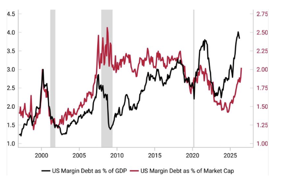
When evaluated against total stock market capitalisation – FINRA margin debt currently sits around 1.8 per cent to 2.0 per cent. This ratio is well within historical norms and sits comfortably near the middle of its post-2010 range (Figure 4).
Figure 4. U.S. Margin debt/GDP vs margin debt/market capitalisation
Source: Variant Perception
What Figure 4., tells us is that while total leverage in nominal terms is unprecedented, the systemic debt burden relative to the underlying collateral base is far from an historical outlier.
The rate of change is the real signal
It’s a mistake to fixate on arbitrary macroeconomic ratios across a 100-year timeline. While the dataset may seem large enough to offer some sense of practical precision, the perception is a false one. That’s because a static threshold like “3 per cent of GDP” travelling across a century passes too many structural shifts. There’s the emergence of tech-driven, capital-light business models, index funds, and a huge expansion in institutional market liquidity that collectively argue against a “X per cent of GDP” threshold serving as an automatic market-crash trigger.
Of course, dismissing the leverage warnings entirely is also ill-advised. Any number related to debt that grows 51 per cent in twelve months to reach a record US$1.53 trillion (per FINRA’s June readings) doesn’t need a threshold attached to it to be worth watching carefully.
I’d argue the primary risk in the market isn’t a static ratio, but the velocity of the accumulation of leverage.
Historically, stock markets rarely top out simply because debt hits a specific level. Instead, there may be merit in the idea that markets peak when the rate of change of margin debt growth slows down following a parabolic surge.
There might be a behavioural element to this. When the Fear of Missing Out (FOMO) grows to such an extent that it demands a material expansion of debt, there may be little following-on buying left. Liquidity or buying power simply exhausts itself. When that borrowing spigot turns off, the subsequent absence of incremental marginal buying may create a liquidity vacuum beneath stock prices.
What to watch for
Ok, so margin debt doesn’t trigger a crash, but it’s reasonable to say it acts like an accelerant. This is because it creates structural fragility. All one requires is an external catalyst to trigger downside momentum, forcing margin debt liquidation mechanics to kick in, and cascading margin calls follow, forcing investors to sell whether they like it or not.
To filter signal from noise, you can ignore the simplistic cross-century headline ratios and instead focus on three things:
Margin debt momentum deceleration
Keep an eye on the 3-month and 6-month rate of change in FINRA broker data. A sharp flattening or rollover in borrowing growth following a 50 per cent + annual surge (which we saw last month) has historically provided a more reliable warning signal than a static percentage of GDP.
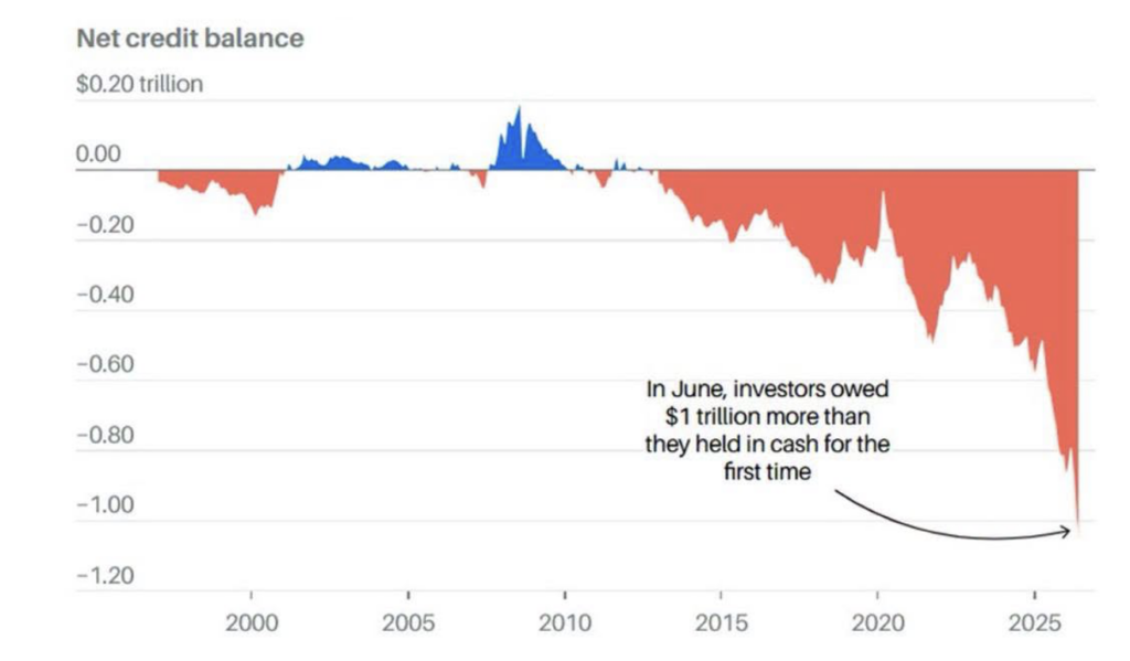
Net cash balances in margin accounts
Look at FINRA free credit balances relative to total debit balances. Net negative cash positions mean investors owe more than they have in cash and have exhausted their liquidity buffers, leaving no cash on the sidelines to absorb sudden shocks. This suggests they’re more likely to sell into shocks rather than buy dips.
Figure 5. Little margin for error
Source: FINRA
Short-term funding & liquidity conditions
Leverage becomes dangerous when borrowing costs spike or collateral haircuts tighten. Keep a close watch on overnight repo rates, short-term funding markets, and corporate credit spreads for early signs of systemic tightening.
Summary
Stories based on static thresholds over a hundred years offer attention-grabbing headlines, but that’s not how markets operate. Today’s record US$1.53 trillion margin debt and its sharp 51 per cent surge reflect undeniable speculative fervour, and yes, it’s reminiscent of the Dot-Com boom. But keep in mind the underlying collateral base supporting that debt has expanded too.
Leverage is real, and the speed of its recent rise warrants some vigilance. But instead, monitor the rate of change, track market liquidity, and remember it’s the sudden slowing of leverage, not an arbitrary GDP benchmark, that usually signals a turn.
By July, FINRA margin debt had already fallen to US$1.42 trillion, around 5.6 per cent below the June record. The risk starts when leverage unwinds, and that unwind also causes falling prices. If that happens, then we can expect some forced selling, which can trigger more selling.

Roger Montgomery is the Founder and Chairman of Montgomery Investment Management. Roger has over three decades of experience in funds management and related activities, including equities analysis, equity and derivatives strategy, trading and stockbroking. Prior to establishing Montgomery, Roger held positions at Ord Minnett Jardine Fleming, BT (Australia) Limited and Merrill Lynch.
He is also author of best-selling investment guide-book for the stock market, Value.able – how to value the best stocks and buy them for less than they are worth.
Roger appears regularly on television and radio, and in the press, including ABC radio and TV, The Australian and Ausbiz. View upcoming media appearances.
This post was contributed by a representative of Montgomery Investment Management Pty Limited (AFSL No. 354564). The principal purpose of this post is to provide factual information and not provide financial product advice. Additionally, the information provided is not intended to provide any recommendation or opinion about any financial product. Any commentary and statements of opinion however may contain general advice only that is prepared without taking into account your personal objectives, financial circumstances or needs. Because of this, before acting on any of the information provided, you should always consider its appropriateness in light of your personal objectives, financial circumstances and needs and should consider seeking independent advice from a financial advisor if necessary before making any decisions. This post specifically excludes personal advice.


Hi Roger,
Excellent article.
He’s how I’d frame the situation. Rather than dismissing margin to GDP as the “wrong denominator,” I think it’s more useful to look at margin/GDP together with market cap/GDP. When both are stretched, they tell a broader story about how much financial asset exposure is sitting on top of the real economy. A margin debt at a record share of GDP and market cap/GDP up around 200% both point to the same underlying reality that we’ve built a very large, very expensive equity market, and part of it is being financed with borrowed money.
Even the seemingly “comfortable” margin to market cap ratio of ~2% isn’t necessarily reassuring. In a high volatility environment, a 20–30% drop in prices can still trigger cascading liquidations. The fact that net cash balances in margin accounts are deeply negative suggests investors don’t have much cash on hand to absorb margin calls. That makes the equity cushion thinner than the headline ratio implies.
And the speed of the recent leverage build up matters. A 50%+ year on year surge in margin debt looks like classic late cycle behaviour such as: FOMO, speculative narratives, and leverage chasing performance. The recent pullback from US$1.53T to US$1.42T looks to me more like the first sign that the leverage surge is topping out. Historically, that’s often happened near market tops. So instead of saying “static thresholds are noise and only rate of change matters,” I’d argue both level and speed matter. Right now, both are flashing amber.
With that framing, here’s how I’d think about the next 12–24 months in broad probability terms:
1. Orderly consolidation or correction (−10 to –20%) ~45% Margin debt growth slows further, some forced selling happens, but funding markets stay functional. We get a sharp but manageable correction as speculative excess is worked off. Leverage comes down without triggering a cascade.
2. Sharper, leverage amplified drawdown (−25 to –40%) ~30% An external shock such as earnings, geopolitics, policy, or rates hits while leverage is still elevated and cash buffers thin. Margin calls accelerate selling, volatility spikes, and the decline is faster than a typical correction. Painful for portfolios, but not a systemic crisis.
3. Extended melt up followed by a later bust ~15% AI and growth narratives stay strong, margin debt re accelerates after the July dip, and markets push significantly higher. Leverage and valuations overshoot further before a more serious unwind a few years out. Current signals are early, not decisive.
4. Benign soft landing ~10% Earnings and macro data gradually justify current valuations. Margin debt drifts lower without drama, liquidity stays ample, and the recent spike proves to be a false alarm.
So in summary I’d say: Leverage doesn’t guarantee a crash, but the combination of record levels, rapid growth, and thin cash buffers means the risk distribution is skewed. The most likely outcomes are either a normal correction or a sharper, leverage driven one.
Cheers
Joe
Hi Joe,Thank you for this exceptionally thoughtful, and well-reasoned comment. You make an excellent point that evaluating margin debt alongside market cap to GDP provides a fuller picture of total financial asset exposure relative to the real economy.I completely agree the speed of the leverage build-up—especially that 50%+ year-on-year surge—is classic late-cycle behavior. Your point about deeply negative net cash balances is also a good one. The equity cushion is definitely thinner and an issue when volatility spikes. Thanks again for sharing.