
A portrait of Australia
A portrait of Australia’s biggest issues in eight charts. Why eight? – it’s a lucky number of course!
I have put together a concise snapshot of the complex economic challenges shaping Australia today.
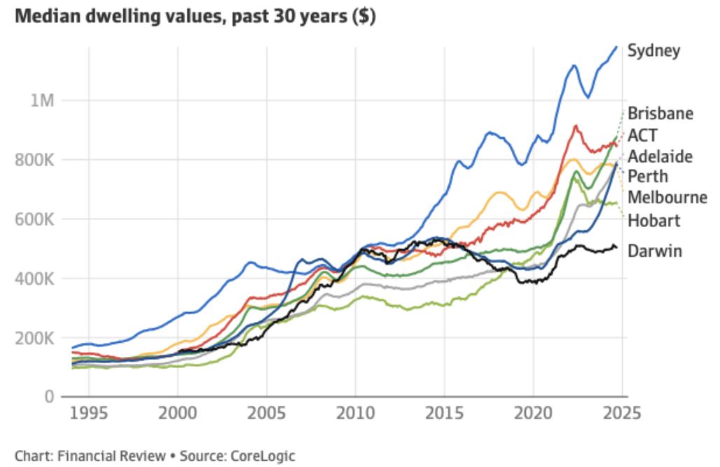
1. Property prices are through the roof.
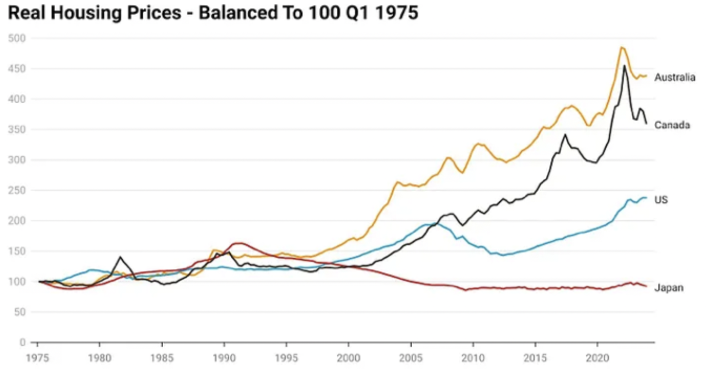
2. In inflation adjusted terms.
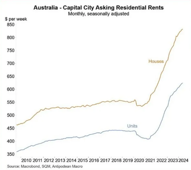
3. Rent costs are also through the roof.
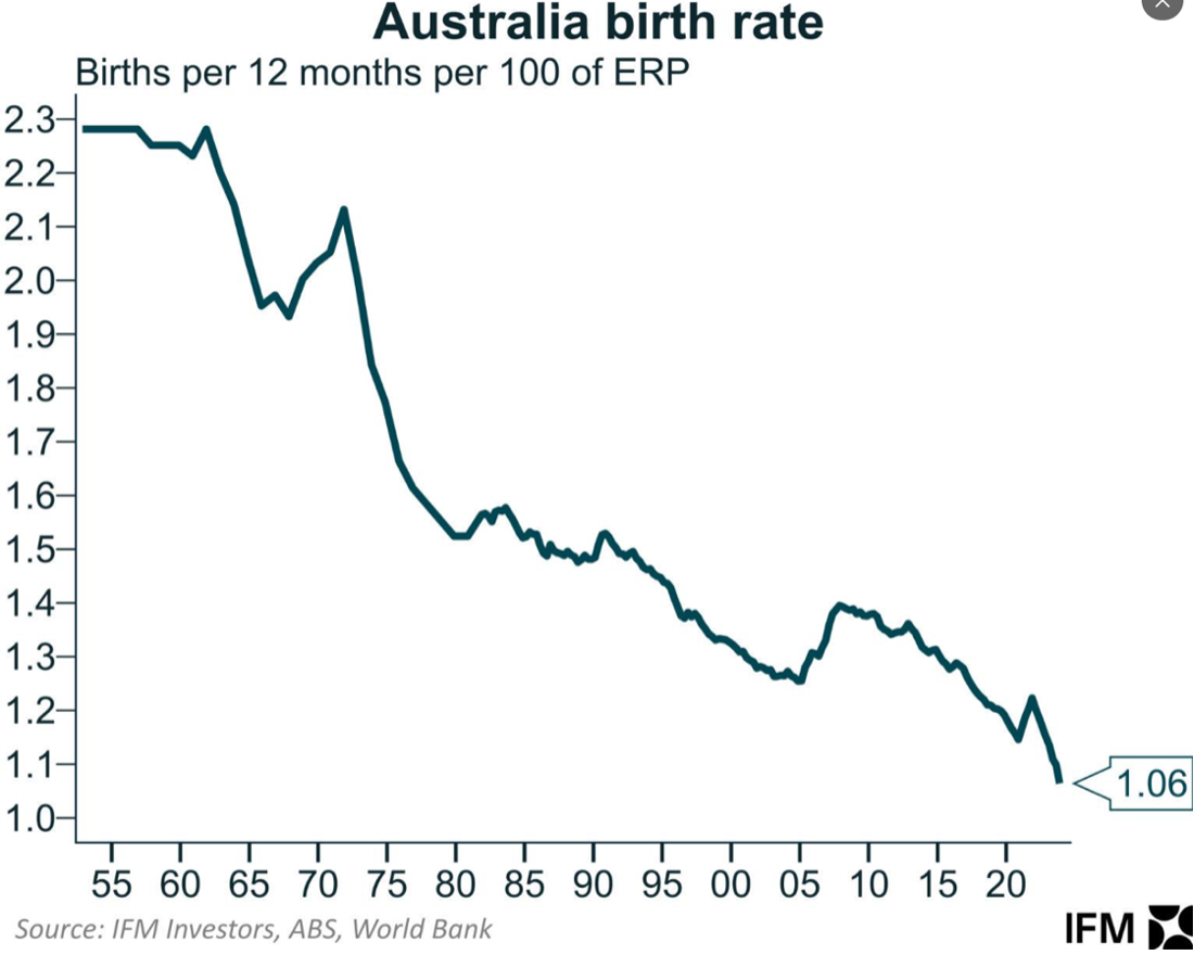
4. But, the birth/ replacement rate is declining. So, the population boom has nothing to do with Australians having more children and requiring more dwellings. ERP = estimated resident population.
5. As an aside, more apartments = less babies. Inversely related.
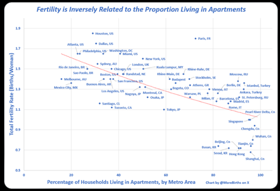 Source: X, @MoreBirths
6. If growing families are not the reason for greater housing demand pushing up Australian property prices and rents, then what is the reason? The answer is immigration.
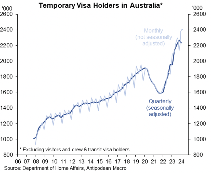
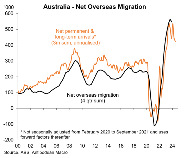 7. …And now almost 10 per cent of the population on temporary visas.
8. Consequently, and thanks to floating rate mortgages, the Commonwealth Bank of Australia’s (ASX:CBA) report into the Australian household sector found that Australia’s debt-to-service ratio currently sits at a record high when compared to other countries.
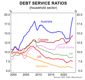
9. …and that leaves less savings to support a consumer-led economy.
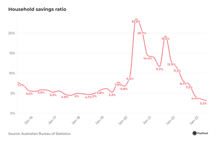
Of course, the answer is to slow or even stop immigration for a while. But if we do that, we’ll expose the true growth rate of the country – a recession. The result of this would be some businesses going broke, some people losing their jobs and asset prices falling. The first two are already happening anyway.
That’s the choice; a recession and a reset, or don’t change anything, and nothing changes. And if nothing changes, we need to keep importing more people to build more apartments for more people to have less babies in. Birth rates continue to fall, the per-capita recession we already have becomes entrenched, and to avoid a broad recession, we have to keep importing more people… rinse and repeat.
Successive governments are just kicking the can down the road. They don’t want a recession on their watch.
Ok, so that was was nine charts, but I added a second house price (inflation-adjusted) chart to highlight prices relative to global peers, which should really be chart 1a.