Time for caution as the Dow hits 22,000
In just five years, spurred on by emergency low interest rates, the Dow Jones Industrial Average has raced from around 13,000 to 22,000 points. Little wonder some market analysts are saying US stocks are now in ‘nose-bleed’ territory. And this is borne out by key valuation indicators.
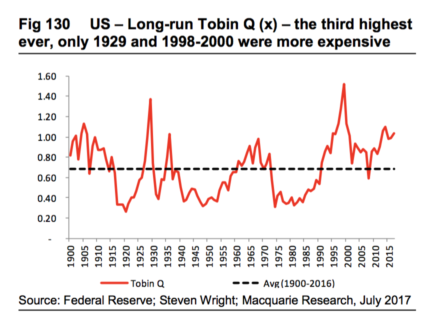
- Tobin Q Ratio
Given stocks represent a title to the ownership of real assets, they should, if fairly valued in a competitive economy, have a market value equal to their cost of production. Q is the ratio of the market value of companies (net of debt) to the replacement cost of their assets. Nobel Laureate James Tobin’s “A general equilibrium approach to monetary theory”, Journal of Money, Credit and Banking, demonstrated the relationship between market value and replacement cost of assets.
The Tobin Q ratio is at the third highest level in 120 years, only exceeded in 1929 and 1998-2000, and compares with the historical average of 0.69.
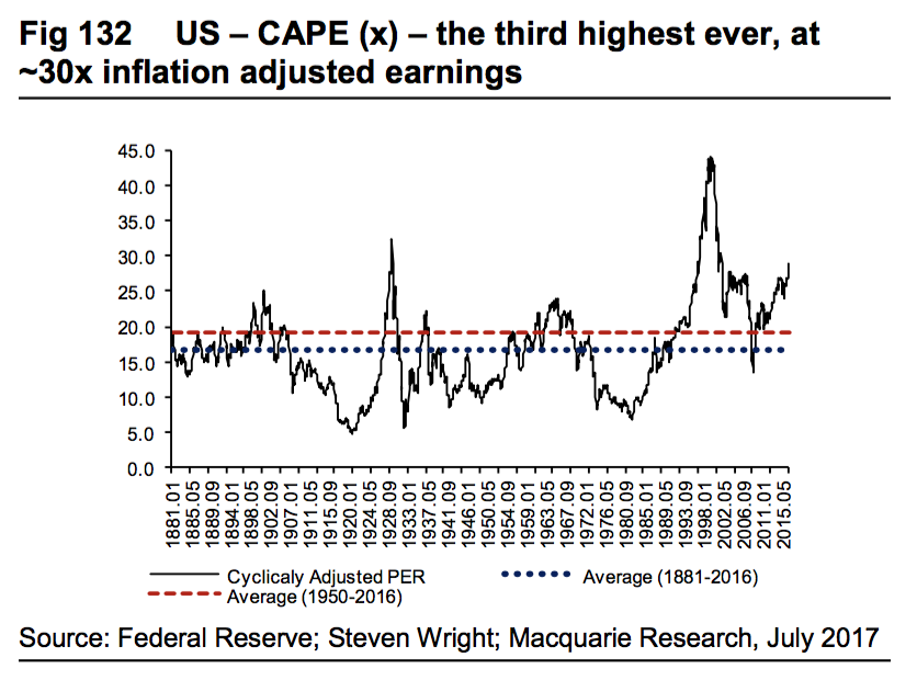
- Shiller CAPE
The Shiller Cyclically Adjusted PE (CAPE) allows for the cyclical fluctuations in profits and takes the average of the past ten years of earnings. Eminent Yale economist Robert Shiller (2000), explains this in his book Irrational Exuberance.
After hitting 32X in 1929 and exceeding 40X in 2000, CAPE is now trading at 30 times, the third highest level since 1881. The average in the past 135 years is 16.7X and the average since 1950 is around 19X.
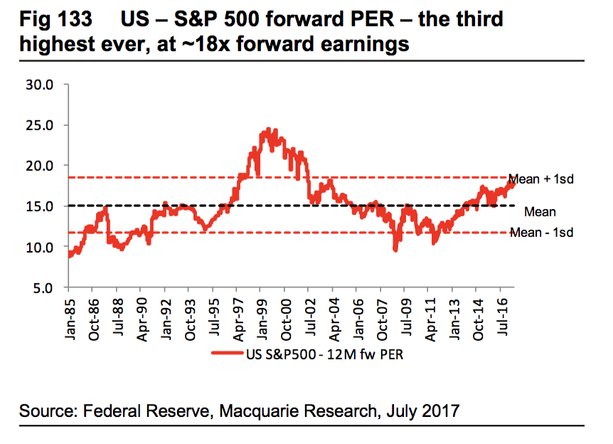
- Forward PE
While I believe this indicator has quite shaky foundations – the forward PE may look very expensive in the middle of a very deep recession or may look cheap when a company/ sector is “over-earning” – the S&P 500 is currently trading at 18X prospective earnings versus its long-term average of 15X.
While many commentators argue US companies generally are “over-earning” relative to “labour”, this is unlikely to go on for an extended length of time without a lot of “weak competitors” falling by the wayside.
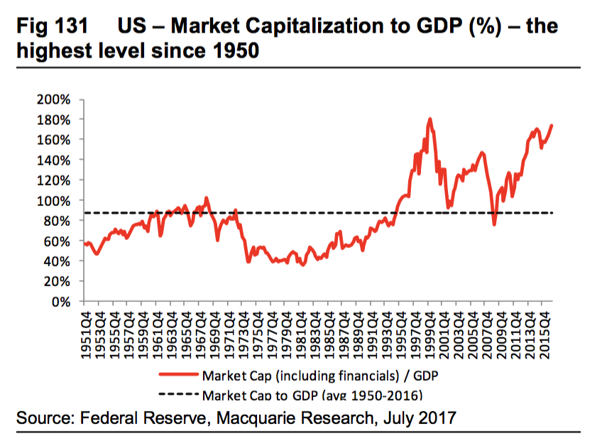
- Market Capitalisation to GDP Ratio
The US equity market total capitalisation to GDP ratio is now trading at its highest level since 1950 at 175 per cent (or closer to 130 per cent of GDP for non-financial businesses). The historical average (including financials) is 87 per cent of GDP.
While it is impossible to predict the factors likely to cause a mean reversion, or when they will occur, some caution is clearly warranted.
Chief Executive Officer of Montgomery Investment Management, David Buckland has over 40 years of industry experience.
David is a deeply knowledgeable and highly experienced financial services executive. Prior to joining Montgomery in 2012, David was CEO and Executive Director of Hunter Hall for 11 years, as well as a Director at JP Morgan in Sydney and London for eight years.
This post was contributed by a representative of Montgomery Investment Management Pty Limited (AFSL No. 354564). The principal purpose of this post is to provide factual information and not provide financial product advice. Additionally, the information provided is not intended to provide any recommendation or opinion about any financial product. Any commentary and statements of opinion however may contain general advice only that is prepared without taking into account your personal objectives, financial circumstances or needs. Because of this, before acting on any of the information provided, you should always consider its appropriateness in light of your personal objectives, financial circumstances and needs and should consider seeking independent advice from a financial advisor if necessary before making any decisions. This post specifically excludes personal advice.
Hi David,
it’s interesting to note that the charts seem to indicate reasonably “safe times” just prior to “Black Monday 1987”, but are accurate earlier in the 1970’s when stocks were in fact “cheap”.