
Despite falling prices, Aussie property is still expensive
If you’ve seen recent headlines about falling property prices, you might form the impression that housing is on the verge of becoming affordable, and that owning a home is again a realistic goal for young people. But the latest data shows that the price falls in most capital cities have been modest at best.
Corelogic (www.corelogic.com.au) is the preeminent data provider on all things property in Australia and they recently released a report with data updated as of the end of June. This is the last data we have full access to but the trends have, as far as we can see, continued in the same direction in July.
June is interesting as this was the first time that property prices on a national level went into negative territory on a year over year (YoY) basis, as this table shows.
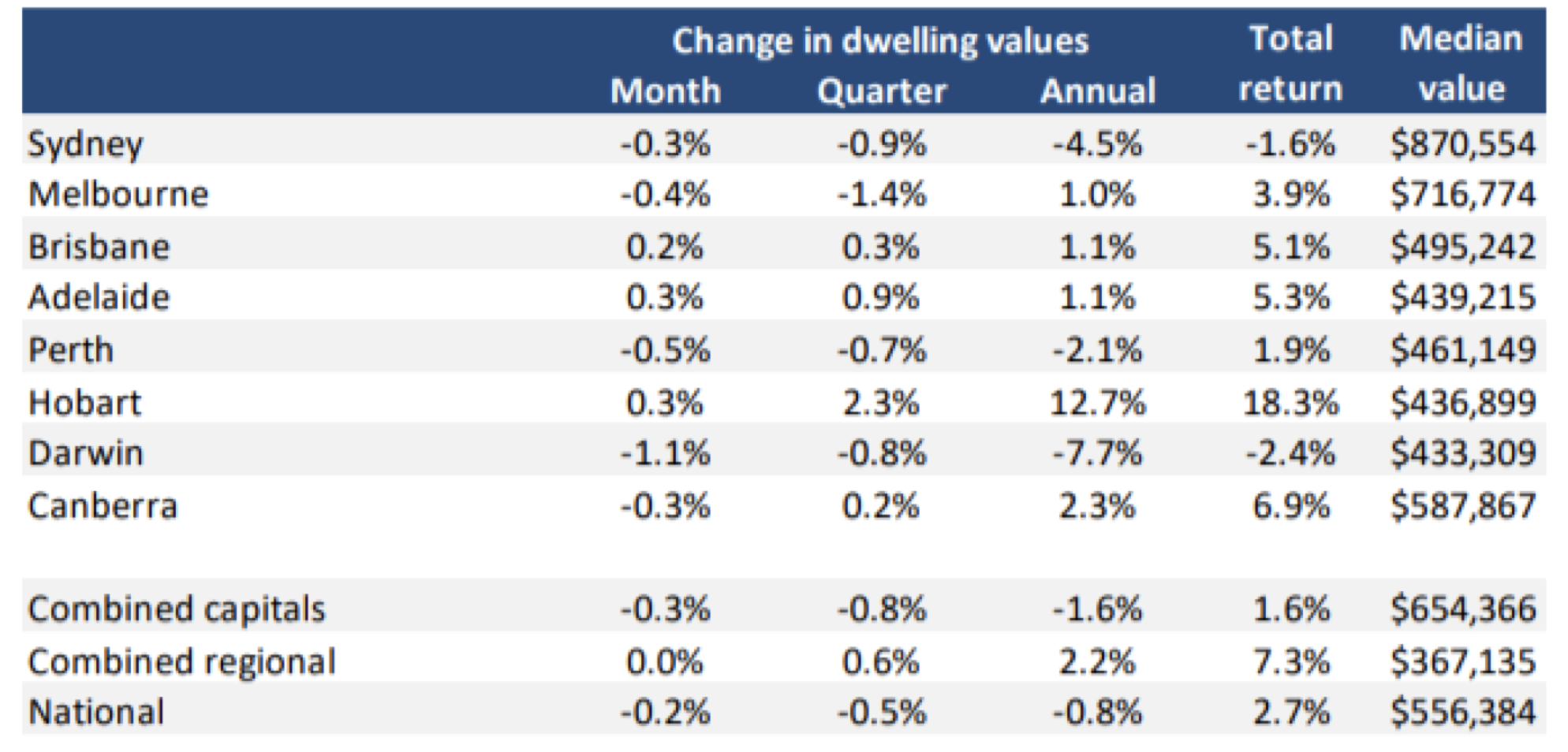
Source: Corelogic
The table also shows it is primarily Sydney that is driving the weakness, which is to be expected as Sydney is the largest property market in the country and was the capital with the largest price increases.
We can also see that there is a stark difference between the capital cities and regional areas (where, on average, there is still price appreciation). There are though significant differences between different parts of the country.
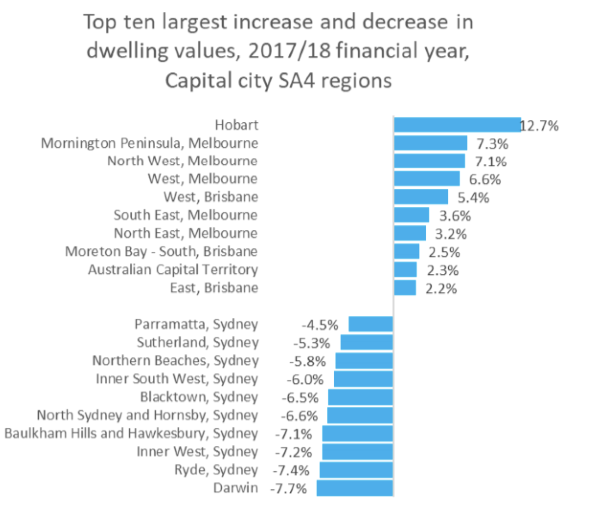
If we start with the capitals, the strongest market was Hobart which saw a 12.7 per cent increase on a YoY basis while the largest falls were (apart from Darwin) seen in central Sydney areas. These are expensive areas which saw some of the largest increases in the last five years and also the highest portion of foreign buyers, suggesting that the punitive measures introduced on foreign buyers are having a significant effect.
 Source: Corelogic
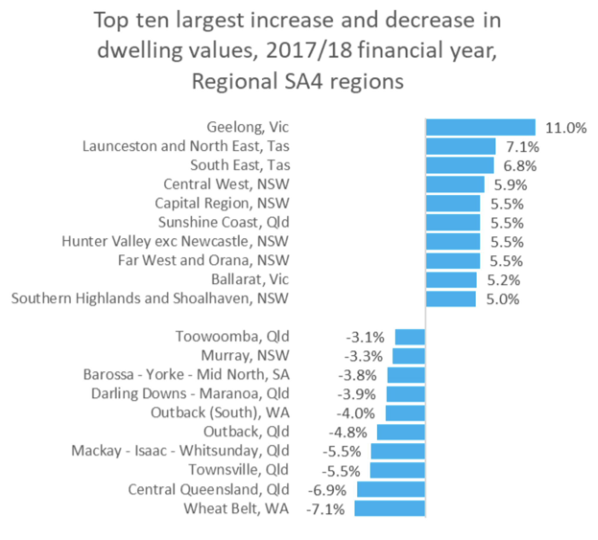
If we look at the largest movements in the regional areas, we can see that the largest increases were generally in areas relatively close to the capital cities indicating that we are seeing people moving out of the capitals but still wanting to stay reasonably close. I guess we can call this lifestyle movements where people are cashing in on their high-priced property in town and move a bit further away where they consider they get more for their money.
The biggest decreases were generally in remote mining dependent areas.
 Source: Corelogic
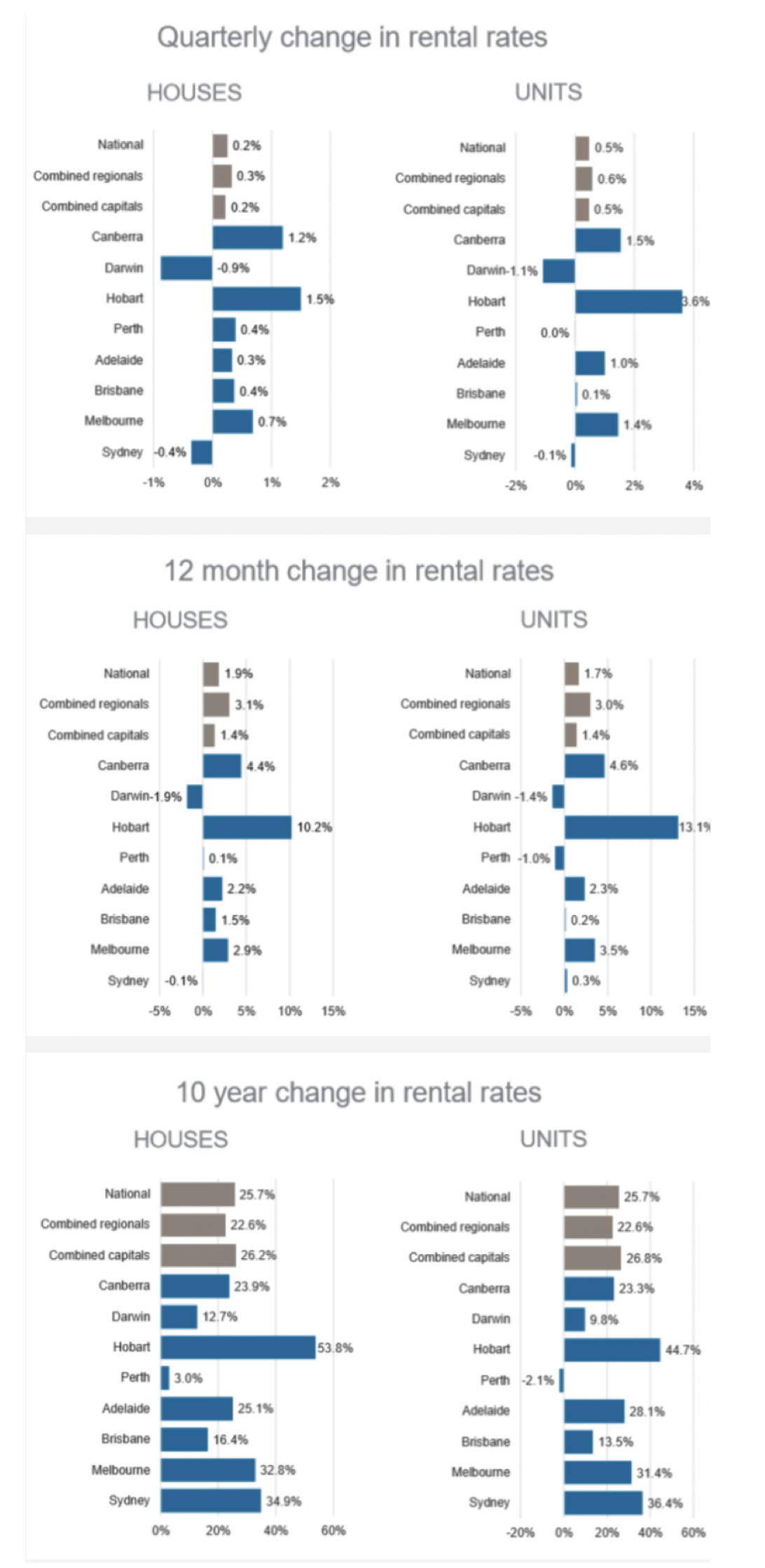
If we look at what is happening with rental rates below, we can see that the picture is very similar, with Sydney and Darwin showing falling rental rates, and rent increases generally tapering off (notice how the quarterly numbers times 4 are quite a bit less than the annual numbers).
Source: Corelogic
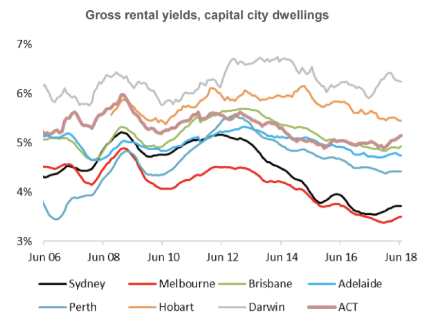
Overall, rental rates are slightly stronger than the prices for properties resulting in slight increases to rental yields (but still at very unattractive levels especially in Sydney and Melbourne).
Source: Corelogic
This post was contributed by a representative of Montgomery Investment Management Pty Limited (AFSL No. 354564). The principal purpose of this post is to provide factual information and not provide financial product advice. Additionally, the information provided is not intended to provide any recommendation or opinion about any financial product. Any commentary and statements of opinion however may contain general advice only that is prepared without taking into account your personal objectives, financial circumstances or needs. Because of this, before acting on any of the information provided, you should always consider its appropriateness in light of your personal objectives, financial circumstances and needs and should consider seeking independent advice from a financial advisor if necessary before making any decisions. This post specifically excludes personal advice.
INVEST WITH MONTGOMERY
Perhaps the most striking thing above is the drop in rental yield in Melbourne and in particular Sydney since 2012. This means that as capital growth stalls – which is inevitable, the endless growth in debt cannot last forever – there is less value in the asset. House prices have a long way to go down in Sydney and Melbourne if they were to only “catch up” to the rest of the pack where they came from – i.e. yield rises from 3.5% to around 5%. As has been reported elsewhere rents in Sydney are falling, so it’s unlikely to come from an increase in rent.
I personally don’t think there will be a dramatic drop in prices unless there is an global economic shock… Which is inevitable!
Pundits are always pointing to the % debt to income level as a metric showing how over-leveraged a particular group has become. Is there something that shows % of avg. interest paid to disposable income? Surely that is a better metric to show affordability?
Hi Dane,
There is indeed data showing interest cost to disposable income and it is roughly in the middle of the historical range. The problem with this measure is though that interest rates are at an historical low point and the general trend for interest rates in the world is rising.
I will try to publish a chart showing this in a future blog post. Thanks for the idea!
Thanks Andreas, I suppose that when interest rates start to increase(as you point out) will be when the %debt to income level starts to become a telling metric.
Affordability
a cynical definition – The ability of low income buyers to acquire debts than they cannot, over the longer term, reasonably pay off.
Yep, this debt noose is getting slightly more affordable.