
COVID-19 Testing data – An update on the US
With the data and markets changing so quickly, we thought it best to simply give you the data and our interpretation in all its raw glory. We checked the US data this morning and the NY data is tracking worse than bad.
According to Figure 1. there appears to be a problem with the testing. By now we should have expected over forty thousand tests per day. But in the past six days we have seen only one day produce more than 20,000 tests.
Figure 1. New York Daily Test Count
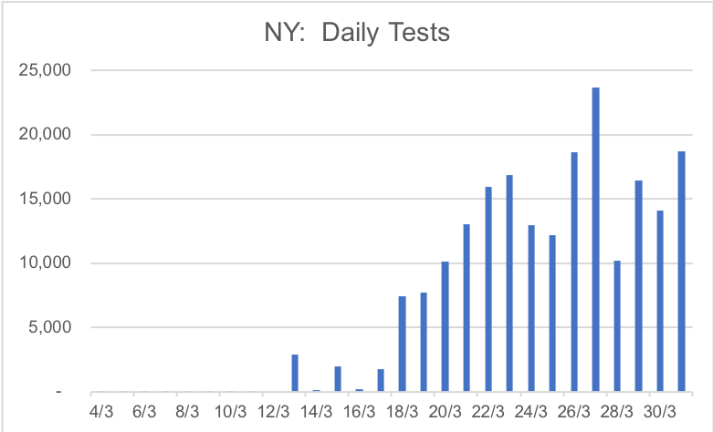
Source: The COVID Tracking Project, Montgomery
And despite a lack of scaling up the tests, a significant scaling of positive cases is occurring according to Figure 2.
Figure 2. New York Daily Cases COVID-19
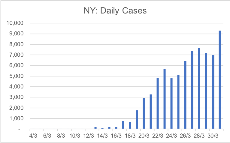
Source: The COVID Tracking Project, Montgomery
As Figure 3. illustrates, detection rates (DR) are sky high. If testing is going to be the tool used to control the outbreak, the US needs to see detection rates under two per cent consistently. We are a long, long way from that.
Figure 3. Half of the tested population has COVID-19
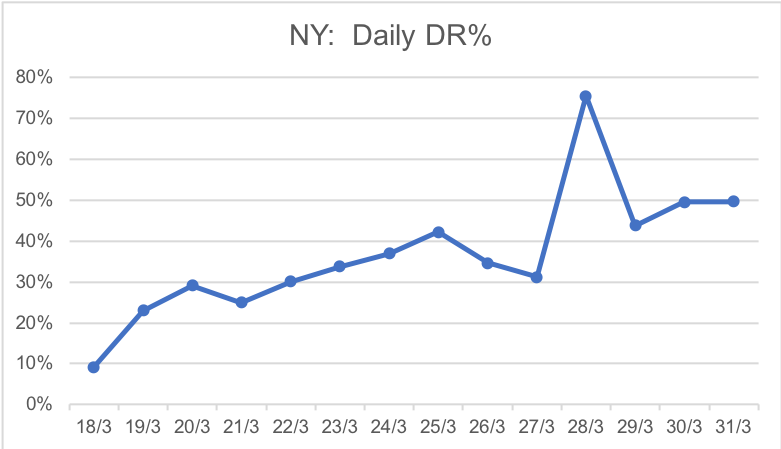
Source: The COVID Tracking Project, Montgomery
Have a look at the Y-Axis in Figure 3., yep, that’s 50 per cent Detection Rates. Half of the tests are returning positive!
And as Figure 4. Demonstrates, deaths have exploded in a week. Every 4.5 mins yesterday sadly someone in New York died of COVID-19.
Figure 4. Fatalities
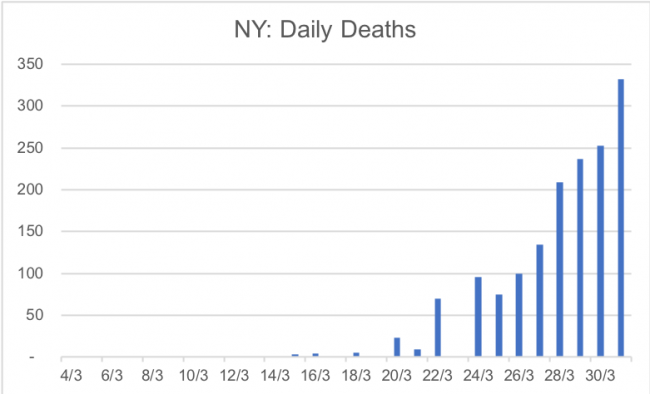
Source: The COVID Tracking Project, Montgomery
Internally at Montgomery we are a bit tired of seeing how incompetent the US and UK are at testing (Figure 5.) By way of comparison, the US is testing at the same rate Italy was 11 days ago.
Figure 5. US and UK hopeless
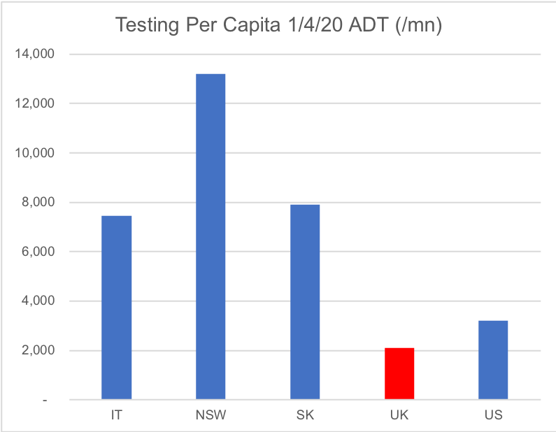
Source: The COVID Tracking Project, Montgomery
And finally, comparing New York to Italy (Figures 6 & 7) in terms of cases per capita at the same evolution since “day 1”; NY is still tracking at 5-6 times Italy at this stage of its evolution.
Figure 6. Cases per Capita (Logarithmic)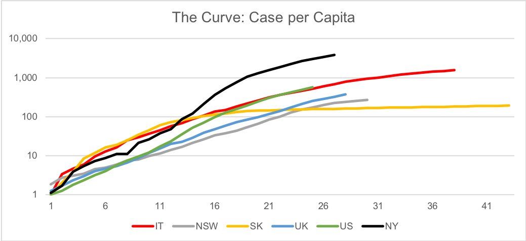
Source: Montgomery
..And Figure 7, the same chart as Figure 6 but linear. Some things you have got to see the old fashioned way to understand the scale
Figure 7. Cases per Capita (Linear)
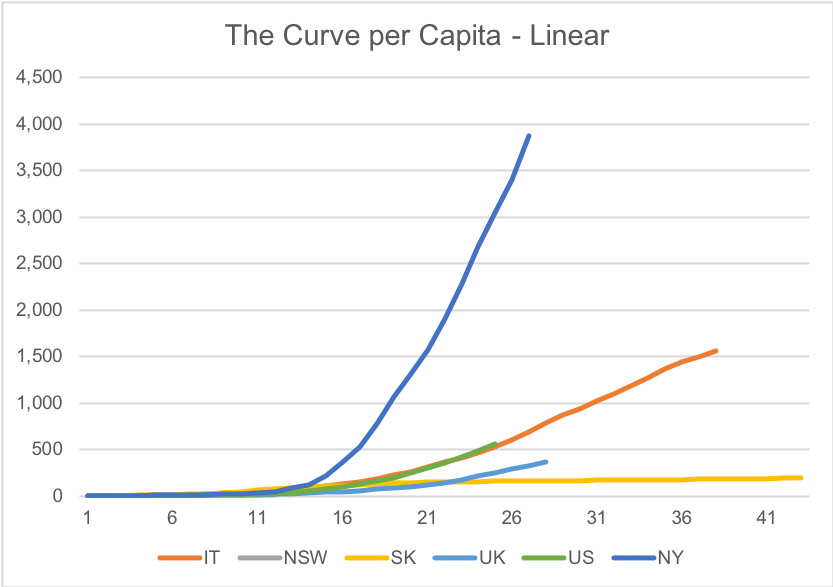
Source: Montgomery
Conclusion. The US is worse than Italy. The land of the free.
Gary Rollo is the Portfolio Manager of the Montgomery Small Companies Fund. Gary joined Montgomery in August 2019 after spending three years at MHOR Asset Management in Sydney as a Founder and Portfolio Manager. Prior to this, Gary was a Portfolio Manager at Renaissance Asset Manager in Sydney for six years. Before moving to Australia, Gary spent five years in London running Morgan Stanley’s Technology Sector Equity Research Team, as well as two years covering technology companies for JP Morgan.
This post was contributed by a representative of Montgomery Investment Management Pty Limited (AFSL No. 354564). The principal purpose of this post is to provide factual information and not provide financial product advice. Additionally, the information provided is not intended to provide any recommendation or opinion about any financial product. Any commentary and statements of opinion however may contain general advice only that is prepared without taking into account your personal objectives, financial circumstances or needs. Because of this, before acting on any of the information provided, you should always consider its appropriateness in light of your personal objectives, financial circumstances and needs and should consider seeking independent advice from a financial advisor if necessary before making any decisions. This post specifically excludes personal advice.
Hi Team
I have been following your posts on Covid-19 over recent weeks.
The problem i have with all this analysis is the data (which is the official data) being used is clearly flawed. The fact that detection rates in NY are north of 50% and they are hardly doing any testing at all.
It would not at all be surprising if the number of cases in NY is 10x higher than what the reported numbers show.
But even if you factor that in I’m still left wondering what that means.
Hi Matthew, if they test 1million people and 500,000 people come up positive, that’s a detection rate of 50%. If they test 10 people and 5 people come back positive, that’s also a detection rate of 50% but a lot less testing. The dection rate is the percentage of people tested that are positive. I have no doubt there are more people in absolute terms that are positive but not being tested. A detection rate of 50% refers to the proportion of people being tested. Hope that helps.