
A little perspective on sentiment
With Donald Trump deliberately flooding the media with daily, if not hourly, meme-worthy pronouncements, investors are understandably bereft of an opportunity to sit back and take stock of what’s been happening in markets so far. This is that opportunity.
Figure 1., reveals the year-to-date (YTD) performance of a variety of asset class benchmarks. EAFE is the acronym for Europe, Australasia, and the Far East. The MSCI EAFE Index is a stock market index that measures the performance of large and mid-cap companies across 21 developed markets around the world excluding Canada and the U.S.
Figure 1. Where money has been made and lost in 2025 so far.
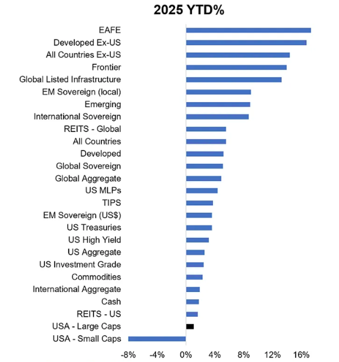
Source: Topdown Charts, LSEG
Another chart that might help provide some perspective for investors, or simply provide entertainment, is the Euphoriameter.
The Euphoriameter combines three key gauges of investor sentiment towards the S&P 500, including a survey of bullish sentiment readings, a 12-month forward price to earnings (P/E) ratio, which aims to measure confidence in future earnings growth, and the VIX, which is an implied volatility index measuring expectations of volatility, a proxy for risk. The resultant composite index is designed to indicate the level of “euphoria” or otherwise in the market.
Figure 2. The Euphoriameter at 31 May 2025.
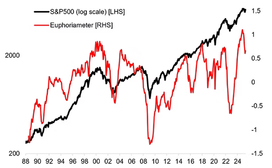
Following a significant reset over the previous month(s), the index is still at the upper end of the historical range, suggesting the overarching mood remains bullish. Those who fancy themselves as interpreters of the index suggest it is also in the late stage of its bullish cycle but that late stage may be extended given the recent pull back, which they refer to as a ‘reset’.
I would point out that the index gave a similar reading in 2003 and yet the S&P500 rallied strongly for another five years. That should immediately cause investors to be somewhat circumspect about this ‘insight’.
Finally, it’s probably worth reflecting on where market valuations sit relative to history. Figure 3., reveals the 1yr forward P/E ratio for the S&P 500 alongside the P/E for the S&P 500’s median (middle) company.
Figure 3. S&P 500 Forward P/E Ratios: Actual & Median
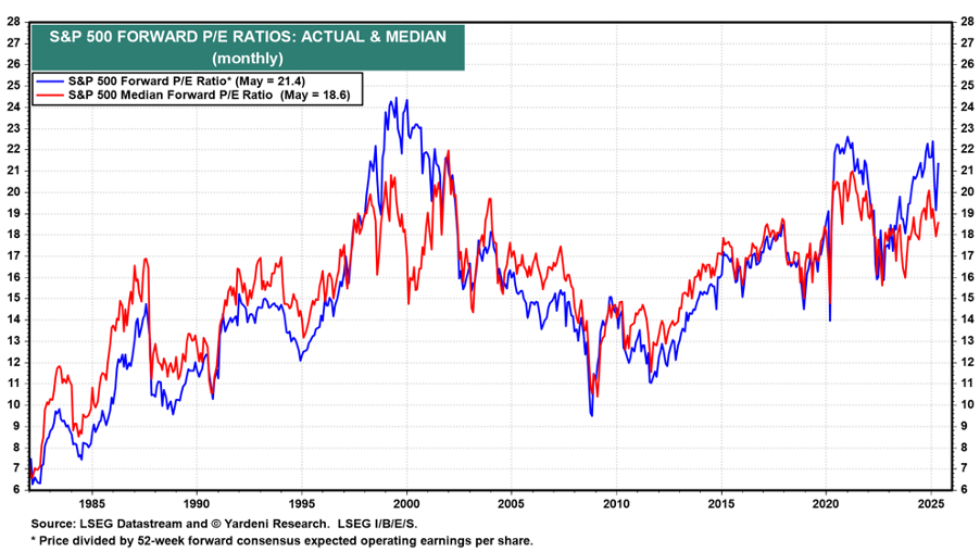
Source: LSEG Datastream and Ed Yardeni, Yardini Research
What appears most obvious is that the market valuation of the S&P500 remains at some of the highest levels in 45 years, but the last time P/E were at this level were just before COVID hit. In the absence of COVID, I wonder whether we would have seen P/E ratios plodding around at current levels for five years.
Remember high P/E are not an indicator of an imminent crash. Theoretically, markets can remain high forever because they merely reflect investors’ willingness to pay those multiples. What makes investors want to pay less? Fear, often inspired by something unexpected.
I think that fear might rise later in the year as we approach a major global debt refinancing round, which could pull the liquidity rug out from under markets from 2026 through 2027.
In the meantime, it seems there’s nothing in the above indicators to suggest an imminent change to current sentiment.
Roger Montgomery is the Founder and Chairman of Montgomery Investment Management. Roger has over three decades of experience in funds management and related activities, including equities analysis, equity and derivatives strategy, trading and stockbroking. Prior to establishing Montgomery, Roger held positions at Ord Minnett Jardine Fleming, BT (Australia) Limited and Merrill Lynch.
He is also author of best-selling investment guide-book for the stock market, Value.able – how to value the best stocks and buy them for less than they are worth.
Roger appears regularly on television and radio, and in the press, including ABC radio and TV, The Australian and Ausbiz. View upcoming media appearances.
This post was contributed by a representative of Montgomery Investment Management Pty Limited (AFSL No. 354564). The principal purpose of this post is to provide factual information and not provide financial product advice. Additionally, the information provided is not intended to provide any recommendation or opinion about any financial product. Any commentary and statements of opinion however may contain general advice only that is prepared without taking into account your personal objectives, financial circumstances or needs. Because of this, before acting on any of the information provided, you should always consider its appropriateness in light of your personal objectives, financial circumstances and needs and should consider seeking independent advice from a financial advisor if necessary before making any decisions. This post specifically excludes personal advice.